课程思维导图
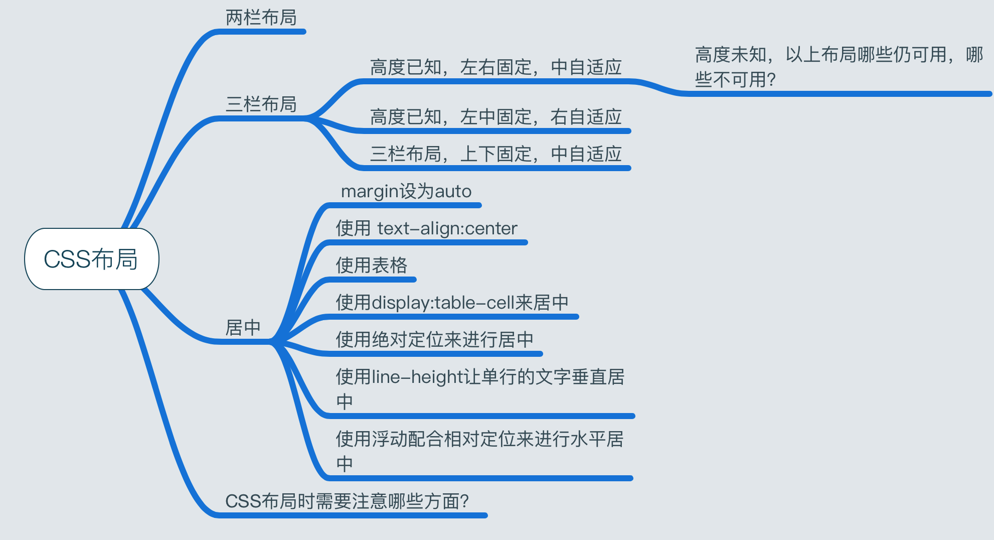
Q:三栏布局,高度已知,左右两栏固定,中间自适应的三栏布局有几种实现方式,各自的优缺点是什么?
123456789101112131415161718192021222324252627282930313233343536373839404142434445464748495051525354555657585960616263646566676869707172737475767778798081828384858687888990919293949596979899100101102103104105106107108109110111112113114115116117118119120121122123124125126127128129130131132133134135136137138139140141142143144145146147148149150151152153154155156157158159160161162163164165166167168169170171172173174175176177178179180181182183184185186187188189190
<!-- float实现 优点:兼容性好 缺点:脱离文档流,DOM节点顺序错误 --><section class="float"> <style> .float .left { float: left; width: 300px; background: green; } .float .center { background: yellow; } .float .right { width: 300px; float: right; background: red; } </style> <article class="left-center-right"> <div class="left"></div> <div class="right"></div> <div class="center"></div> </article></section><!-- absolute实现 优点:快捷 缺点:脱离文档流 --><section class="absolute"> <style> .absolute article > div { position: absolute; } .absolute .left { left: 0; width: 300px; background: green; } .absolute .center { left: 300px; right: 300px; background: yellow; } .absolute .right { width: 300px; right: 0; background: red; } </style> <article class="left-center-right"> <div class="left"></div> <div class="center"></div> <div class="right"></div> </article></section><!-- margin负值实现 优点:兼容性好 缺点:节点顺序错误,需要多一层额外的div,出问题难以排查 --><section class="margin"> <style> .absolute .center { width:100%; float:left; } .absolute .main { margin: 0 100px; background:yellow; } .absolute .left { float:left; width: 300px; margin-left: -100%; background: green; } .absolute .right { width: 300px; float:right; margin: -300px; background: red; } </style> <article class="left-center-right"> <div class="center"> <div class="main"></div> </div> <div class="left"></div> <div class="right"></div> </article></section><!-- flex实现 优点:新布局方式,解决以上两种布局方式的缺陷 缺点:兼容性较差 --><section class="flex"> <style> .flex { margin-top: 110px; } .flex .left-center-right { display: flex; } .flex .left { width: 300px; background: green; } .flex .center { flex:1; background: yellow; } .flex .right { width: 300px; background: red; } </style> <arctile class="left-center-right"> <div class="left"></div> <div class="center"></div> <div class="right"></div> </arctile></section><!-- table实现 优点:兼容性好、快捷 缺点:单元格限制,当某个单元格高度调整时,其他单元格也会被调整 --><section class="table"> <style> .table .left-center-right { width: 100%; height: 100px; display: table; } .table .left-center-right div { display: table-cell; } .table .left { width: 300px; background: green; } .table .center { background: yellow; } .table .right { width: 300px; background: red; } </style> <arctile class="left-center-right"> <div class="left"></div> <div class="center"></div> <div class="right"></div> </arctile></section><!-- grid实现 优点:将网格布局标准化,将复杂问题简单化 缺点:兼容性差 --><section class="grid"> <style> .grid .left-center-right { display: grid; width: 100%; grid-template-rows : 100px; grid-template-columns : 300px auto 300px; } .grid .left { background: green; } .grid .center { background: yellow; } .grid .right { background: red; } </style> <arctile class="left-center-right"> <div class="left"></div> <div class="center"></div> <div class="right"></div> </arctile></section>
Q:三栏布局,高度未知,以上布局哪些仍可用,哪些不可用?
- float:不可用
- absolute:不可用
- flex:可用
- table:可用
- grid:不可用
Q:三栏布局,高度已知,左中固定,右自适应
与左右固定,中自适应的三栏布局
Q:三栏布局,上下固定,中自适应
|
|
Q:CSS居中布局有哪些,适用于什么场景,举例说明?
一、CSS居中:margin设为auto
- 做法:把要居中的元素的margin-left和margin-right都设为auto
- 场景:只能进行水平的居中,且对浮动元素或绝对定位元素无效。
二、CSS居中:使用 text-align:center
- 场景:只能对图片,按钮,文字等行内元素(display为inline或inline-block等)进行水平居中。但要说明的是在IE6、7这两个奇葩的浏览器中,它是能对任何元素进行水平居中的。
三、CSS居中:使用line-height让单行的文字垂直居中
- 做法:把文字的line-height设为文字父容器的高度
- 场景:适用于只有一行文字的情况。
四、CSS居中:使用表格
- 做法:td/th元素设置align=”center”、valign=”middle”即可处理单元格里面内容的水平和垂直居中问题
- 场景:必须是table
五、CSS居中:使用display:table-cell来居中
- 做法:通过display:table-cell 模拟表格单元格,这样就可以利用表格那很方便的居中特性了。
- 场景:IE6、IE7都无效。
六、CSS居中:使用绝对定位进行居中
- 场景:只适用于宽度或高度已知的元素。
原理:通过把这个绝对定位元素的left或top的属性设为50%,这个时候元素并不是居中的,而是比居中的位置向右或向左偏了这个元素宽度或高度的一半的距离,所以需要使用一个负的margin-left或margin-top的值来把它拉回到居中的位置,这个负的margin值就取元素宽度或高度的一半。
1234567891011121314151617<div class="parent"><div class="child"></div></div><style>.parent {position:relative;}.child {width:100px;height:100px;position:absolute;left:50%;top:50%;margin-left:-50px;margin-right:-50px;}</style>
七、CSS居中:使用绝对定位进行居中
- 场景:只适用于宽度或高度已知的元素。且只支持IE9+,谷歌,火狐等符合w3c标准的现代浏览器。
原理:这里如果不定义元素的宽和高的话,那么他的宽就会由left,right的值来决定,高会由top,bottom的值来决定,所以必须要设置元素的高和宽。同时如果改变left,right , top , bottom的值还能让元素向某个方向偏移。
123456789101112131415161718<div class="parent"><div class="child"></div></div><style>.parent {position:relative;}.child {position:absolute;width:100px;height:100px;left:0;right:0;top:0;bottom:0;margin:auto;}</style>
八、CSS居中:使用浮动配合相对定位来进行水平居中
- 场景:不用知道要居中的元素的宽度,缺点是需要一个多余的元素来包裹要居中的元素。
原理:把浮动元素相对定位到父元素宽度50%的地方,但这个时候元素还不是居中的,而是比居中的那个位置多出了自身一半的宽度,这时就需要他里面的子元素再用一个相对定位,把那多出的自身一半的宽度拉回来,而因为相对定位正是相对于自身来定位的,所以自身一半的宽度只要把left 或 right 设为50%就可以得到了,因而不用知道自身的实际宽度是多少。
123456789101112131415161718192021<div class="parent"><div class="wrap"><div class="child"></div></div></div><style>.parent{width:300px;height:200px;border:1px solid #ccc;}.wrap {position:relative;float:left;left:50%;}.child {postion:relative;left:-50%;}</style>
Q:CSS布局时需要注意哪些方面?
- 语义化掌握到位
- 页面布局理解深刻
- CSS基础知识扎实
- 代码书写规范